How many of us have ever bothered to wonder why the titles appear in the places they do? And why the director chose that certain font in their movie? I didn't pay much attention to either until we learnt about why they did what they did.
Let's start with the opening credits. There are actually different types of openings, believe it or not. The most popular movie opening is a narrative opening. Don't know what that means? Neither did I. It's basically when the beginning of the story is rolling and the titles appear on the screen at the same time. It doesn't interrupt the film at all, it kind of blends in with it. This is used in tons of movies like 'The Stepfather' and 'Panic Room'.
Another type of opening would be a discrete title sequence. Lost? This is when the story and the titles are shown at separate times. For instance in 'Se7en' a short clip is shown from the movie is shown before the the screen changes and the names of the actors of directors are shown. Still lost? Watch the clip below. It'll make more sense.
A movie could also be opened with the titles on a blank screen. Surely thats self expanatory. This is completely unoriginal but is used in quite a few movies. The audience have to watch the opening titles then and it gets pretty boring. It doesn't bring much excitement but it makes the movie feel a little (just a little) eerie. An example of this would be the film 'Donnie Darko'.
The final type of opening would be a highly stylised edit. Are you thinking 'what?' This is where the beginning of the movie and the credits are also put together but it has a music video sort of thing about it. Does that make sense? Action movies normally have this. Like 'The Taking of Pelham 1,2,3'. There is a music track in the background which is matched witht he actions on screen. Alot of editing is done with these types of openings. In my opinion, these keep the audience most hooked.
Moving on to font. Have any of us really taken a second to think about the font? Not really. I mean why would you, right? In actual fact, we do notice the font, it's just the main thing we see. Its' noticed in the back of our minds. And seeing as we will eventually make our own opening sequence the font will be a major(ish) thing for us to consider even if the audience won't talk about it.
The font we use could be:
a) Serif. As you can see in the picture a serif font has a sort of flick type thing at the end of the letters. They look quite formal and pretty old fashioned. This is a font you would use when typing a letter or something to make it look professional. For a title sequence? Somehow i don't think so.
b) Sans Serif. The 's' at the end of sans is silent. I think. The term comes from a french word 'sans' which means without. In this case, the letters are without the flick type thing at the end of letters. This gives the words a more informal look about them and I think they look way better than Serif fonts.
But a font represents much more than just presenting you with the title. They, or in fact anything, has a connotation and a denotation.
A denotation is the obvious. So if you look at the font, it would be the size, colour, shape etc.
A connotation is in between the lines. So in a font, it could symbolise what the movie could be related to. If your thinking 'How can a font tell you what the movie is about?' You should be surprised by stuff I'm about to tell you. Hopefully.
Take a look at this font that James Cameron used for Avatar. Does this font look familiar to you? No? Yes? It is in actual fact, Papyrus.
They don't really look the same do they? The conclusion I sort of came to was that James Cameron paid the makers of the font so that he could change it to make it look the way he wanted it. Because this font is one of the orignal fonts in all word processing software. Did you know that? Probably not. So why did James Cameron use such a common font? My first answer? He couldn't afford a fancy font. My second answer? He could just get any old font and edit it with his magical editing software and make it look even more amazing. It went something along those lines.
If you look at the Papyrus font, it's pretty thin, stick-like and ancient looking. These would be the denotations. The things you notice straight away. The connotations could be that it symbolises treasure maps, old movies and not much technology around. Papyrus is the paper Egyptians used to write on. It's made from layers of thin tree bark compressed with water.
The Avatar title connotations are that the letters are all capital letters. They are all evenly spaced out and are a blue-ish silvery metallic sort of colour. The denotations to all this are that it looks sort of alien-like, stepping into the unknown or undiscovered.
Mix the connotations and denotations of both fonts...and that gives you the reason why James Cameron chose this font.
During the lesson we watched a documentary about the importance, types and guidelines to a good film opening.
"...films need to seduce their audience into long term commitment. While there are many types of seduction, the temptation to go for instant arousal is almost irresistible." - Thomas Sutcliffe
The author, Thomas Sutcliffe compared movies to relationship and movie openings to types of seduction. He states that the opening sequences have to be exciting and seductive enough for the audience to be drawn in and continue the relationship but at the same time not show off too much so that there are things left in the actual movie to attract our attention. "...instant arousal..." as Mr. Sutcliffe said, can cause the rest of the movie look boring and unattractive. This completely defeats the purpose of an opening sequence. It should make the audience watch and wonder what will happen next and not wait for the end.
However there are exceptions to that for example showing a flash forward (something that happened later in the movie) as an opening. It can be packed with action but it has to be clear that it is the future so that we won't leave the audience confused and asking all the wrong questions. A if done successfully it will make the audience curious and leave them wondering what happened to lead to this and why. An example of a successful movie opening:
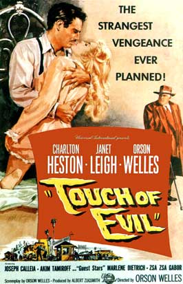
Explosions are often used in opening sequences because they instantly add more action to the movie, however they have to be used wisely. A director of "Touch of Evil" wanted to create a magnificent opening sequence which shows a typical day in persons life but with an explosion at the end. The opening was created in a single shot which makes it even more impressive. What made it so suspenseful is the fact that the audience knew from the beginning that something is going to happen but the characters didn't. This is exactly the definition of the word suspense which Alfred Hitchcock explained few posts back. Whats interesting is that this movie was made before the legendary movie "Psycho" by Mr Hitchcock. There was only one thing with that opening sequence, surprisingly it were the titles. They distracted the audience from the movie making it less effective. The director sued Universal Studios and wanted the titles removed but he lost.
"Touch of Evil" poster
Here is the opening sequence of "Touch of Evil" without the titles:
To enhance the pressure and to understand a little more about the importance of movie openings, as a class, we watched the 'watching documentary. It contained lots of information about the different opinions on what needed to be included in a successful opening and gave us plenty of tips on what we needed to make just that (a successful opening I mean).
During the film, openings (and films in general) were reffered as seduction. For example Thomas Sutcliffe stated that "films need to seduce their audience into a long term commitment. While there are other types of seduction, the temptation to go for instant arousal is almost irresistible." A translation: To people like us, this may not make much sense in the whole 'film opening' concept. Please, allow me to explain...
"seducing the audience" is basically getting the attention of the audience that is watching the movie, therefore, the "long term commitment," is the duration of the movie.. yes.. simple now you know right? The " temptation to go for instant arousal" comment is talking about the opening of the film, he states that the obvious and most tempting way to get and keep an audience's attention is through a brilliant, action packed opening. However, doing this can cause the rest of the film look boring in comparison, as a result film makers need to plan their opening carefully. Giving the audience enough information to grab their attention, but not enough drama to make them loose interest in the rest of the movie.
According to director Jean-Jacques Beineix (shown right), there are quite a few risks involved with 'instant arousal.' He believes producers and directors should learn to wait, he states that both the audience and film makers would gain more satisfaction if the film reaches a gradual climax than if it peaks at the beginning and carries on trying to match the drama shown at the first scene. He also says that 'Instant arousal' can cause too much expectation of the film, which then results in the film not being as well liked as it should be! ...he has a point.
The Art of the Title Sequence is a website showing the world the beauty of title sequences as well as how and why they were made this way. Designers themselves are answering questions and discussing their work.
I have chosen randomly, a title sequence of a new movie that I have't seen before and analysed it. I wanted to choose something that I haven't seen before so that I wouldn't know what will happen in the movie and so that I'll describe the aspects of the title sequence more fairly, showing my first impressions of the movie.
I've decided to analyse title sequence of "Blue Valentine"
Most of the titles are against a black background which makes the audience concentrated on the right things at the right time.
From the title it seems that it will be a romantic movie but it doesn't seem that way when the movie starts. The opening is very dark. We can barely see anything on the screen. Lights or fireworks to be more precise are the only things that allow us to see whats hidden behind the darkness. The fireworks are slow at the beginning and they show only parts of still images.
The music is slow and quite calm at the beginning, it sounds a bit sinister but not enough to make it a horror. It was more of a dramatic music, quite sad but it quickly picked up pace and literally exploded when the title appeared. We could see this picture much clearer showing two lovers kissing ;) As I've watched the opening sequence it seemed a little bit like a music video. Whenever the music got faster, the fireworks got bigger and more impressive. Also the images behind the fireworks showed happier
moments that it did when the music was slower and the image was darker. In conclusion I think that it was a really good opening sequence but the use of still images made it a little bit slow. I think that this movie is a romance but with bits of mystery or drama which is indicated by the covering of the images and the music.
A narrative opening is an opening when the titles appear over the actual movie. "The Stepfather" and "Panic Room" are film with this type of openings.
A discrete title sequence is when the titles run witha separate sequence behind i.e. an animation or a sequence that will set the mood. "Se7en" and "Arlington Road" are examples of this type of openings.
"Donnie Darko" and "Dead Calm" have titles over a blank screen, followed by the narrative opening. This brings all the attention to the titles because there is nothing to distract the viewer. This might also create a sense of suspense as seen in "Donnie Darko"
A narrative opening with highly stylised editing can look very impressive and is very time-consuming in post-production (editing). "The Taking of Pelham 123" is an example of a movie with this type of editing. Additionally this movie synchronised the image to the beat so it looks a bit like a music video which makes it even more enjoyable to watch.
When choosing a specific title sequence to analyse, I had a good long think...for about 4 seconds.
I thought 'hey, why not choose a film which is renown for its opening titles?' What comes to mind?
"Bond, James bond."
As a result I watched and chose to write about the film James Bond:Quantum of Solace.
The film has a distinct title sequence, looking and sounding more like a music video than a title sequence. This unique aspect segregates the opening section of the film and makes it more memorable and entertaining.
Lacking originality, the sequence starts off with the distribution company then, the main actor's name (Daniel Craig), followed by the writer and the actual title of the movie as shown above.
As the rest of the Titles appear, it seems to just be written over the 'story,' appearing in the spaces that lack much attention, drama and detail. For example, the 'sand dune transition' during the title of the actor Giancarlo Giannini contains lots of long shots and establishing shots which show the audience the setting for most pf the ilm, however they don't realise this at the moment. This helps give them a sense of familiarity when at the scenes set in this area, maybe emphasising the sense of shock when danger comes round the corner.
What appeals to me about this opening is the 'music video' feel, although towards the end it feels a bit drained and long. It is a great introduction to the film, and this section is made to open and reach out to all types of audiences, going further than the stereotypical overweight man who secretly wishes to become a spy, that watches these movies.
there are many different types of movie openings,
Firstly there is the 'narrative opening with the tittles running throughout,' this is probable one of the simplest and most popular openings and is used in films such as 'The stepfather,' and 'Panic room.'
Then, there is the discrete title sequence, where the title sequence is a different and separate section of the film, films that include this are films such as 'Se7en,' 'Enemy of the state' and the 'James Bond,' films.
Another style of opening sequence is the very unimaginative 'titles over a blank screen followed by a narrative' opening. If used well, this can cause a very creepy and tense atmosphere as shown in the opening of the film 'Donnie Darko.'
The final type of opening is the 'Highly stylised edit that is distinct from the rest of the film.' this is usually used in action and fast paced film to grab the audiences attention straight away. it is seen in films 'the taking of Pelham 12,' and 'Mesrine.'
For analysing anything, mail things we need to highlight are the Denotations and the Connotations. Denotations is what the image/movie actually shows and what an audience can actually see and feel is apparent.
For example, a denotation of the picture on the right is; a grey scale picture of a hooded person than is sitting alone by a sea. Connotations are what the stimulus may implicate or mean in a particular scenario. Connotations are subjective and change depending on the person that is connoting the piece. For example, I would connote this picture by saying that, it is a lonely man sitting alone near water, the bland colours emphasise his loneliness and create a bleak and cold atmosphere.
To work on our skills of connoting and denoting fonts for films, in groups we did just that. Our group's movie poster was 'The fast and furious.' And on the left is a picture of our acctuaall work :-)
Here are some examples of our connotations and denotations:
Although many of us don't really pay that much attention (that we know of) to the font of a film title, it makes a Huge difference in the way our minds perceive it. As a result, our group have realised that we need to put in a whole lot of thought in to what font we use for our title. It is a TITLE sequence after all....
There are Two main types of Font:
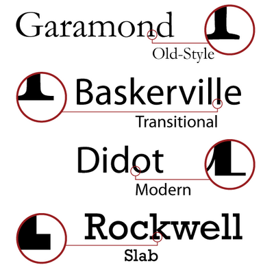
1) Is a 'Serif' font, such as the one used in the blog. A 'serif' is basically a short line that flicks off the main strokes of a letter or character. Serif fonts are usually used in more traditional and formal pieces of text and would probably be appropriate for a psychological thriller or a period drama.
There are four main types of Serif font; Old style, Transitional, modern and Slab. These can all be seen in the picture on the right.
2) The second is a 'San Serif' font, these fonts seem to be a little less formal and give a more amiable impression. 'San' is a french word for 'not' therefore the term'san serif' is pretty self explanatory, it doesn't have the short line that flicks off the edges. It is stereotypically used for light-hearted films such as comedies.
Here is a video, which isnt to do with fonts for Films, but explains the difference between the fonts and gives examples of different, commonly used fonts in these categories and what they can be used for.
To practice our connotation and denotation skills we had to analyse the font used in a poster for a movie. My group had to analyse the font for "BIG Mommas House" which is a comedy film. This can be clearly seen by looking at the picture but if you look closely at the font it shouts COMEDY. On the right there is the actual poster and our notes on it and on the left there are the same notes but only with a close up of the title to show that the title/font itself can tell the audience so much even if the message is just subliminal. The font is large, red and in different sizes which would be very unusual for any other film genre. The 'B' and 'G' in BIG may suggest female anatomy because of the unnatural (for a font) curviness and the fact that there are no spaces between characters in the word 'momma's' and 'house' can suggest the main character being too big to fit anywhere or it may relate to the fact that he's wearing a costume and so is the font.
Today we have learned the importance and meaning of movie titles and fonts used. Denotation which means the general appearance; the colour, shape, thickness. For example a small island:
...is surrounded by a blue ocean, it's full of trees, it's small.
On the other hand connotation explores the meaning of an object for example this island may represent luxury, tropics, loneliness, isolation.
We looked at the font used in Avatar and how simple and common it is. Papyrus which was used is one of the fonts built in most of word processing software which makes us wonder why movie such as Avatar used it.
This font looks old, handwriting-like, tribal, natural and simple. It may be associated with treasure maps, old movies, low technology cultures but with the use of blue colour and the shining gives it an alien look. The evenly spaced letters and longer tails with the first letter 'A' and 'R' seem to take more space making the title more eye-catching.
Sans Serif
The letters are sans serif (which means that they dont have the little bits at the end of a letter) which makes them look less professional and more casual, modern and informal compared to serif which look more formal, old fashioned and elegant.
Examples of Sans Serif fonts are: Gill Sans, Helvetica, Arial and Verdana.
Serif
Examples of Serif fonts are: Georgia, Times New Roman, Courier and many more.
The other day we had a lesson introducing us to cameras. To make our film we're going to use cameras. Obviously. I was excited. Because one of the reasons I chose media was that I knew we were going to be using cameras. I love using them. And I liked the fact that we got an inside look of how a movie works and being on the other side of the camera.
What I learnt:
The basic functions of the camera i.e on/off, zooming, AF/MF, play back etc.
How to use a tripod
The main rules when using a camera
How to take different shots
There were alot of things I learnt that I didn't know before, because I haven't really used a professional camera like the ones we used in the lesson. But as we were going through it, I got more and more excited and was itching to get my hands on one.
When we finally got one, we were given a task to make a mini movie. We had to take an average (well boring) task and make it a much more exciting one by using different camera shots, editing and sound. When we were filming, I was actually a bit confused when we we began because we had all the ideas down on a storyboard, but you had to film everything in a different order than to how it would be in the final cut.
Our task to make someone reading a newspaper more exciting. I actually enjoyed making it, from the storyboarding (which was my least favourite bit) to editing. Konrad and I were the 'directors' and Ryan was our actor. The process itself was entertaining as we filmed it in the library and people's reactions to the camera were quite entertaining.
Overall, I have come to this conclusion. I like filming.
Enemy of the state. The opening sequence. one minute and fourty eight seconds of organised chaos.
When we create our own opening sequence, we would obviously have to add in who produced and starred in it, and where else to put it but in the opening. So as well as scaring the wits out of the audience in some way, we are also going to tell them who was a part of it.
In class, we had to watch this and note down all the different people who were listed. The production a distribution companies came first, of course, but in this specific clip, we came to the decision that someone had cut them out. Why? No idea. But the people that we did see in the clip were:
The name of the movie (of course. otherwise you would be watching an untitiled movie. how are suppose to rant on about the movie to others if you don't know the name?)
The Actors (well, not all of them. but the ones with the most lines. also known as the main characters. these tend to have the most famous celebrities because they would play the main role. in this case, it would be Will Smith)
Directors (not the director director, but the directors of things like casting, photography and music. they play a huge part in the movie because without them there would basically be no movie.)
Designers (they are amazing. you have to admit. the costume and production designers make the movie look 'normal' or as if it was happening on any day. they do a good job of it. their hiring costs would tell you.)
Editors (because then you would be watching reels and reels of failed stunts and messed up lines.)
Producers (execitive producer. then the actual producer. it seems as though the order becomes opposite as to how it began. from here it will go low to high)
Writer (there would be no amazing and flawless script if it wasn't for these guys.)
Director(this person always gets the last opening credit because if he hadn't had a sudden idea that could 'possibly take off' there would be no action thriler movie for us to watch. and how sad would that be.)
First, it took me ages to pronounce the word. But when I finally did, I conducted a little research and finally came up with this:
Intertextuality is when a film borrows ideas, scenes and other things like that from another movie, often made many years ago so people don't really recognise the similarities unless they're a film boffin like...not me.
So it's a fancy word for copying. Not bad.
In class we watched The Stepfather, a remake of the original version released in 1987. This film had no special effects and based purely on the element of suspense had us on the edge of our seats. I'll give you three major scenes where the suspense was literally oozing out of the screen. I have to admit, they were my favourites too.
The first suspense filled scene is when David (the dad) doesnt like Mrs Cutter (the neighbour) being suspicious of him, so he goes to kill her. He sneaks into her house and we all know he's in there and it's only a matter of time till she finds him. She walks to her death. Quite sad really. But she follows one of her cats to the closet and gives her a mean purr (if thats possible) and with quick cuts between shots David is suddenly not in closet as we suspected but standing behind her and we all jump out of our seats. The sheer speed of her death shocks us into oblivion because this is the first time we see him actually kill someone. Scary.
The second scene I thought was full of suspence was not a death scene. Your probably thinking 'what??' but when Michael and David go out to eat lunch and David talks about his daughter and calls her by the wrong name. I thought there was plenty of suspense there because in previous scenes, Michael is already suspicious of David and is weary of him. And this teensy weensy little mistake just made it worse.
The third and final scene was the one that literally made me jump and have a mini heart attack. This was when Michael and David are fighting on the roof and David slips off the edge. I was kind of expecting him to be there, as this is something that is common is most thriller films. But I didn't see him, and for a split second I thought that he had actually fallen and died. And in that split second was when the director decided to cut from the empty place to Michaels' face and back to the empty edge where David suddenly pops out. That scared the hell out of me. But it was genius.
Overall, the movie was quite quick and jumped from shot to shot, which was something that worked as an advantage. I really liked this movie. Even though I was scared out of my wits for half of it.
Unfortunately, I wasn't available the day of the filming for the task, however I would like to think that I had a key role in the editing of it, especially when it came to the sound.
Although I wasn't there, I knew that the group would take a wide variety of shots, including close ups, long shots, mid close ups and mid close ups.
The basic idea of the movie was that the main character (played by Ryan) goes to look at the 'Page 3' of the newspaper 'The Sun.' This light-hearted comedy theme was emphasised by the up beat funky music beat in the back ground. We used an equally past paced style of editing which created a sort of montage effect to the film, I believe it brought the movie a more 'teen' vibe and more urban feel/ atmosphere.
To edit and add music to our movie we used 'final cut pro,' which at first seems quite complicated, but just like everything once you get the hang of it, life becomes eaassyyy :-)
Sadly, our equipment didn't look as high-tech as this picture below but... it'll give you an idea about how cool our editing corner was. =P
The first three minutes are the opening. Although I was definately tempted to watch more. This is a crime/action thriller. You don't really get that in the opening, unless you count the two burglars. In these three minutes you wouldn't think that this was a thriller of any sort. But it is. Hence why it's on here.
It begins with an instrumental track, something you wouldn't really expect from a thriller. It has a calming effect on the audience and is only the start of a set up. Insert the names of the production and distribution companies. But no-one really bothers to look at those. Really they don't. Insert a soundtrack. Non diegetic of course. It's a song. Called...i don't know. But it's one of those songs. That gives you the feeling that everything is alright. You see a little girl making a necklace for her mum. But in the beckground you hear some sort of drilling sound. When I first heard it, I immediately thought 'what's that noise?' But then the scene changes and we see where the noise is coming from. Cut to the main character having a conversation with his daughter and then knocking noise appearing in the background. All of a sudden, it's 'what was that??' and another voice from a character not in the scene appears. The knocking again. And again. 'Isn't someone a little impatient?' But the audience's interest suddenly increases when he is about to open the door because everyone's curious to know who it is. You would obviously expect some action, and yet when he opens the door, you still jump. How the heck...? I thought you knew something was going to jump out? The bass drone and the amplified sounds of the bat hitting the main character mixed together shock you and you sit there and wait for your heart rate to return back to normal. You watch with huge eyes as the two 'burglars' beat the crap out of the main character and tie him up. The wife walks in and your immediately shouting in your head 'Nooooo....what are you doing?!!' The same thing happens to her. And one of the 'burglars' stab both of them. Horror is etched on your face. But you think, at the same time, 'its okay. The girl is safe. As long as she doesn't come out...' But of course. She doesn't listen to you. Why on earth would she do that? She gets taken away, and we're left with two dying characters. Great.
The opening is probably one of the most important ways to keep the audience on edge. It sets the bar. And if executed properly, can make the viewers rave about the movie for months. And probably buy it on DVD. Which is good.
What I have learnt from this is that suspense is the key. You have to give away just the right amount of action to keep the audiences' curiosity peaked. Use close ups to make them focus on one thing and forget about the rest. Add in subtle music. Amplify sound to scare them. In this particular opening, it starts off quite slow and relaxed before having a sort f turning point that completely opposes the start. You need to build the suspense/ tension slowly, make it seem like something is going to happen but it doesn't. Not until the third time when the audience are thinking, 'Is anything going to happen?' And then BAM. Mini heart attack.
A thriller has many sub-genres. Why? because. just because. it's because there are so many of them, that they need sub-genres. And here they are:
Political Thriller
Romance Thriller
Crime Thriller
Mystery Thriller
Spy Thriller
Action Thriller
Humorous (in some way) Thriller
Supernatural Thriller
Psychological Thriller
There are probably many more, but I would say that these are the main ones. My favourite would have to be...a psychological thriller. I love the way they can twist your mind and make you feel scared. Don't you? Okay. maybe not. There is also a lot of suspense. Something that makes a good movie!
Disturbia (released in 2007) is one of my favourite movies. It's sort of psychological because the main character is suspicious of his neighbour and no-one really believes him...but then they do. eventually. but i think the plot line is great. and it has a lot of suspense. which is amazing.
For our group film (or opening sequence) you can't really show much in the beginning, so i would say that making a psychological thrill would be out of the question. but doing an action-y, mystery-ish, spy sort of thriller would work for me. i don't know how to put that in an opening sequence but hopefully we'll make it work. somehow.
Last week we had a task to plan, draw a storyboard, film and edit a boring, everyday action and make it more exciting. We had to make reading a newspaper (not so exciting activity) enjoyable to watch. On the 12th of January we only managed to plan and film our sequence and today we finished our piece.
We chose and cut the shots so that the sequence looks professional and flows really well without any unexplained, sudden movements. We also cut the shots to different lengths so that there is more movement and action as our actor (Ryan - Group 19) reads a newspaper.
We also added background music which we had to convert in Quicktime player from .mp3 format to .mov or .aiff format which is more compatible with Final Cut Pro.
Lastly we used software to change the quality of our movie so that we could upload the video online. We kept the original file on the hard drive.
In class, we were asked to analyse a given title sequence. Group 16 were analysing the political thriller 'Enemy of The State' starring Will Smith. Our first instruction was to state the production distribution companies, however in the opening sequence we watched, it didn't show the names of any. We eventually came to a conclusion that the names must have been cut off before the clip got put onto Youtube and were told that the production and distribution companies names and logos are shown before the the movie begins.
We were then asked to list the information that the movie did give us, this includes:
The name of the film
The main actors
Casting, Musical and photographic directors
Costume and production designers
Editors
Executive producers
Producer
Writer
Director
We also made not to where in the clip the title of the film appeared. As you can see from the film above, the title is the first thing you see, according to our class, this is quite unusual.
Here is a timeline of the video showing where in the video specific things were shown. This should give us a general idea of where to put titles in our own film.
There are many sub-genres of thriller movies. There are medical thrillers, sci-fi thrillers, political thrillers and even techno thrillers... but what exactly is a sub-genre?
Well it simply means a category of a genre for example a disaster-thriller movie which is a thriller film where the scenes involve natural or artificial disasters such as earthquakes or nuclear disasters. '2012' is an example of disaster thriller movie including suspense, mystery and sense of uncertainty about the actions and what will happen next which appear commonly in thrillers but also there are earthquakes, volcano eruptions and floods. This helps to attract a wider target audience, people who enjoy watching thrillers as well as people who enjoy disaster movies or both.
LiveType is a very useful tool to create titles in a movie. There is a variety of fonts as well as animations, backgrounds and other effects. Using this software can make the title sequence look much more professional if used properly. The screenshots show some of the basic options such as changing colour, size and font of text.
There are hundreds of effects to chose from. Many very cheesy and cliche (never to be used) effects but some if used well might look very impressive. Most of the animations and textures are not good enough to put on our final movie because too much is happening making the whole sequence unprofessional.
Click to Enlarge
What I like about this program is the ability to edit almost every aspect of the title such as the lengt of the animation, size and transition of a particular letter or a whole word. It is easy to put the title at the right place by putting the rough copy of the movie in the background and aligning the titles and then simply exporting only the titles.


_by_Erling_Mandelmann.jpg) The " temptation to go for instant arousal" comment is talking about the opening of the film, he states that the obvious and most tempting way to get and keep an audience's attention is through a brilliant, action packed opening. However, doing this can cause the rest of the film look boring in comparison, as a result film makers need to plan their opening carefully. Giving the audience enough information to grab their attention, but not enough drama to make them loose interest in the rest of the movie.
The " temptation to go for instant arousal" comment is talking about the opening of the film, he states that the obvious and most tempting way to get and keep an audience's attention is through a brilliant, action packed opening. However, doing this can cause the rest of the film look boring in comparison, as a result film makers need to plan their opening carefully. Giving the audience enough information to grab their attention, but not enough drama to make them loose interest in the rest of the movie.


 The music is slow and quite calm at the beginning, it sounds a bit sinister but not enough to make it a horror. It was more of a dramatic music, quite sad but it quickly picked up pace and literally exploded when the title appeared. We could see this picture much clearer showing two lovers kissing ;) As I've watched the opening sequence it seemed a little bit like a music video. Whenever the music got faster, the fireworks got bigger and more impressive. Also the images behind the fireworks showed happier
  moments that it did when the music was slower and the image was darker. In conclusion I think that it was a really good opening sequence but the use of still images made it a little bit slow. I think that this movie is a romance but with bits of mystery or drama which is indicated by the covering of the images and the music.
 As the rest of the Titles appear, it seems to just be written over the 'story,' appearing in the spaces that lack much attention, drama and detail. For example, the 'sand dune transition' during the title of the actor Giancarlo Giannini contains lots of long shots and establishing shots which show the audience the setting for most pf the ilm, however they don't realise this at the moment. This helps give them a sense of familiarity when at the scenes set in this area, maybe emphasising the sense of shock when danger comes round the corner.
 For example, I would connote this picture by saying that, it is a lonely man sitting alone near water, the bland colours emphasise his loneliness and create a bleak and cold atmosphere.
 2) The second is a 'San Serif' font, these fonts seem to be a little less formal and give a more amiable impression. 'San' is a french word for 'not' therefore the term'san serif' is pretty self explanatory, it doesn't have the short line that flicks off the edges. It is stereotypically used for light-hearted films such as comedies.
 To practice our connotation and denotation skills we had to analyse the font used in a poster for a movie. My group had to analyse the font for "BIG Mommas House" which is a comedy film. This can be clearly seen by looking at the picture but if you look closely at the font it shouts COMEDY. On the right there is the actual poster and our notes on it and on the left there are the same notes but only with a close up of the title to show that the title/font itself can tell the audience so much even if the message is just subliminal. The font is large, red and in different sizes which would be very unusual for any other film genre. The 'B' and 'G' in BIG may suggest female anatomy because of the unnatural (for a font) curviness and the fact that there are no spaces between characters in the word 'momma's' and 'house' can suggest the main character being too big to fit anywhere or it may relate to the fact that he's wearing a costume and so is the font.
 We looked at the font used in Avatar and how simple and common it is. Papyrus which was used is one of the fonts built in most of word processing software which makes us wonder why movie such as Avatar used it.


 We chose and cut the shots so that the sequence looks professional and flows really well without any unexplained, sudden movements. We also cut the shots to different lengths so that there is more movement and action as our actor (Ryan - Group 19) reads a newspaper.


