Denotation which means the general appearance; the colour, shape, thickness. For example a small island:
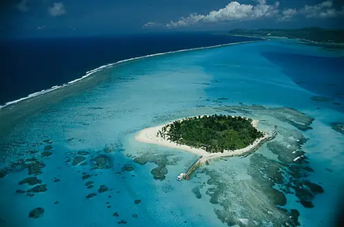 |
On the other hand connotation explores the meaning of an object for example this island may represent luxury, tropics, loneliness, isolation.

 We looked at the font used in Avatar and how simple and common it is. Papyrus which was used is one of the fonts built in most of word processing software which makes us wonder why movie such as Avatar used it.
This font looks old, handwriting-like, tribal, natural and simple. It may be associated with treasure maps, old movies, low technology cultures but with the use of blue colour and the shining gives it an alien look. The evenly spaced letters and longer tails with the first letter 'A' and 'R' seem to take more space making the title more eye-catching.
The letters are sans serif (which means that they dont have the little bits at the end of a letter) which makes them look less professional and more casual, modern and informal compared to serif which look more formal, old fashioned and elegant.
Examples of Sans Serif fonts are: Gill Sans, Helvetica, Arial and Verdana.
Examples of Serif fonts are: Georgia, Times New Roman, Courier and many more.
We looked at the font used in Avatar and how simple and common it is. Papyrus which was used is one of the fonts built in most of word processing software which makes us wonder why movie such as Avatar used it. This font looks old, handwriting-like, tribal, natural and simple. It may be associated with treasure maps, old movies, low technology cultures but with the use of blue colour and the shining gives it an alien look. The evenly spaced letters and longer tails with the first letter 'A' and 'R' seem to take more space making the title more eye-catching.
 |
| Sans Serif |
Examples of Sans Serif fonts are: Gill Sans, Helvetica, Arial and Verdana.
 |
| Serif |
Examples of Serif fonts are: Georgia, Times New Roman, Courier and many more.
No comments:
Post a Comment