1) Is a 'Serif' font, such as the one used in the blog. A 'serif' is basically a short line that flicks off the main strokes of a letter or character. Serif fonts are usually used in more traditional and formal pieces of text and would probably be appropriate for a psychological thriller or a period drama.
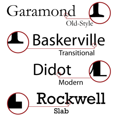
There are four main types of Serif font; Old style, Transitional, modern and Slab. These can all be seen in the picture on the right.
 2) The second is a 'San Serif' font, these fonts seem to be a little less formal and give a more amiable impression. 'San' is a french word for 'not' therefore the term'san serif' is pretty self explanatory, it doesn't have the short line that flicks off the edges. It is stereotypically used for light-hearted films such as comedies.
Here is a video, which isnt to do with fonts for Films, but explains the difference between the fonts and gives examples of different, commonly used fonts in these categories and what they can be used for.
No comments:
Post a Comment